Mount Hermon Site Rebuild
Redesigned and rebuilt the Mount Hermon Camp website
Web design & front-end web development, 2019

Brief

Mount Hermon is a Christian organization with camp centers in the Santa Cruz Mountains and near the California/Oregon border, serving over 85,000 guests each year. It's a place where people from all around the world come to get away, to be in the midst of towering redwoods, flowing streams, clean air, and the fellowship of others on their journey of faith. Beyond hosting ~40 programmed events throughout the year, Mount Hermon serves as a conference center for guest groups and as a provider of adventure experiences and team development programs.

Over the course of six months, I worked with my marketing team at Mount Hermon to rethink and redesign the website. I served as the design lead and front-end developer. My responsibilities were prototyping, creating a UI design system, implementing a new front-end workflow (with Sass/Zurb Foundation 6), and developing master page templates ready for my team to populate with new content.
Tools: Foundation CSS framework, SASS, HTML/CSS

Team: Dan Dawson, Nate Pfefferkorn, Jon Wilcox, Misha Velasquez, Megan Dunlop, Ray Artime
One of the major changes we implemented in the redesign was restructuring the user flow for event selection. 
Every year 40+ distinct events are offered multiple times at 4 different locations for people of all ages. Previously, all events were included in one single event filter/search. We wanted to make it easier for any new users unfamiliar with Mount Hermon's event offerings to be guided along. We landed on funneling users through the following categories: youth, family & adult.
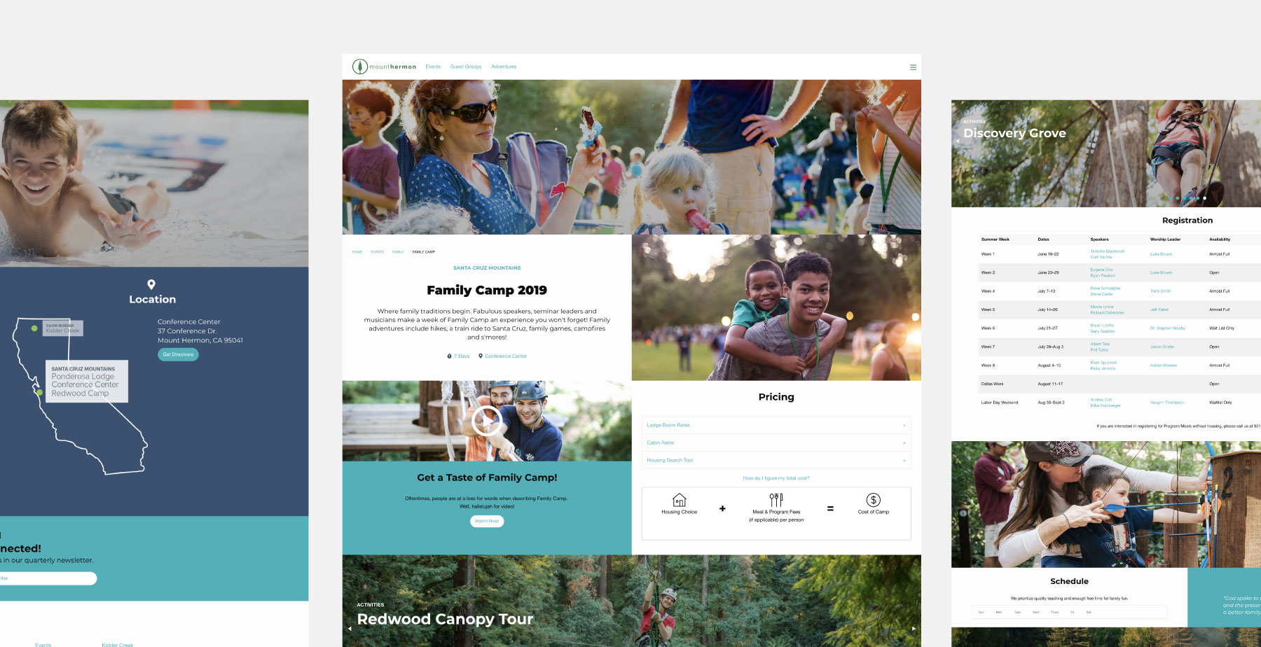
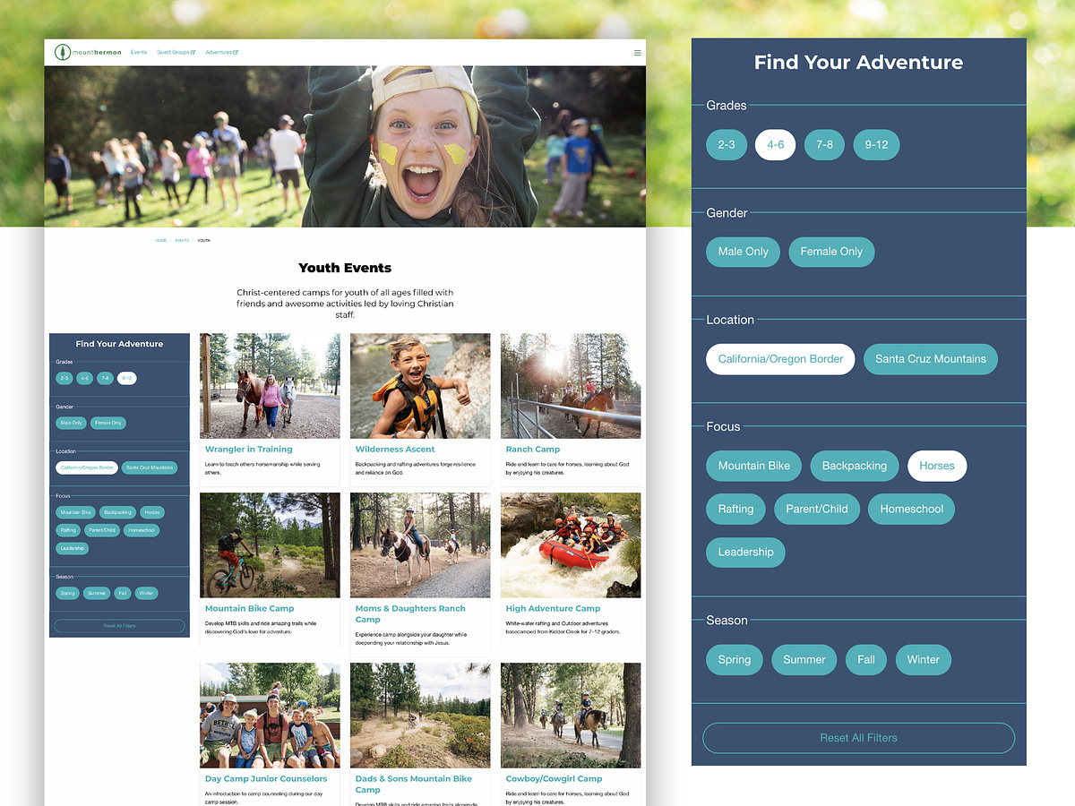
Within the event filter, we simplified categories and filter options to make the process more user-friendly.
Although previously there were only 3 category sections (event type, summer week number + event location) this resulted in 40 different options to wade through in total.

*Funneling guests into 3 separate event searches (Youth, Family, Adult) helped us customize the filter options available. For example, adult events don't need a "grade" filter but offer additional event foci such as "couples, professional, etc."

*Previously, users could select a "Summer Week Number" (Week 1, 2, 3...) which was confusing for new guests and likely not often used by returning guests. We decided to nix it.

*Lastly, the "Event Location" options were also more complicated than necessary. There were 13 sub-location options to choose from! We boiled it down to the 2 geographical regions (Santa Cruz Mountains and California/Oregon Border.)
There was quite a large philosophical shift in how the new website should function– primarily as a marketing tool rather than an information dump.

Information overload? 

There are naturally tons of essential logistics that parents need to know before sending their child to camp (or packing up the whole family) for a week. Previously, our event pages were dominated by text and didn't do much visual storytelling.

Without eliminating any indispensable details, we nested information, consolidated event pages and restructured camp logistical details in a cleaner way. Organizing this info efficiently allow the real-life campers to show what these events offer, thanks to our amazing Mount Hermon photographers!
I'm Joanna Goebel, a freelance web and graphic designer based in Memphis, Tennessee.

Let's Connect!

[email protected]
envelope-olinkedin-squareinstagramdribbble