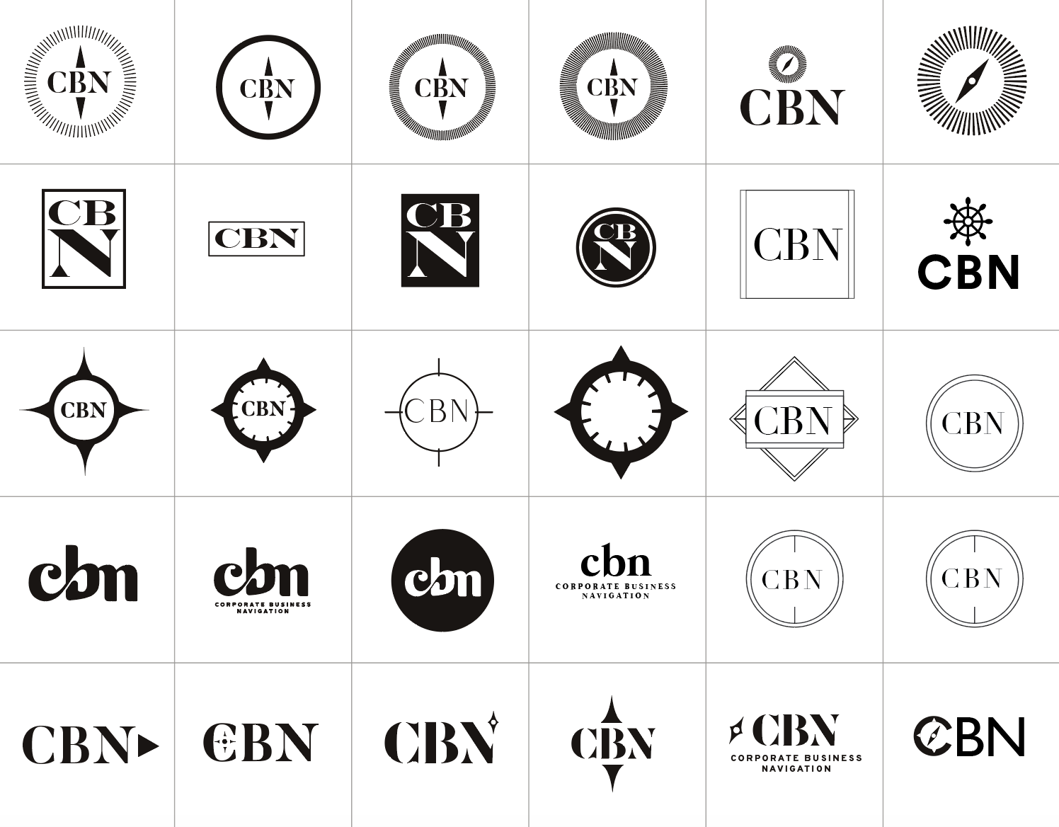
With "navigation" in the title of this business, we knew visual elements related to ship navigation could help story tell this brand. One of CBN's core visions, after all, is helping companies navigate through uncharted waters and move forward.
Here are a few nautical symbols we considered:
Anchor: Though a symbol of security and stability, it doesn’t represent movement or growth.
Ship wheel: Though a symbol of leadership and victory, this wasn’t quite the desired concept either. Rather than “taking the wheel” of the client companies, CBN's role is to support, strategize and empower leaders as they steer their team’s ship.
Compass: Finally we landed on the compass, which symbolizes direction and guidance. Like a compass, CBN provides a sense of safety as business leaders can trust that they'll point their businesses in the right direction. Just as a compass helps sailors orient themselves in open seas, CBN helps businesses not only find direction but to stay the course.