Happy Glamper Girl

Branding design for vintage, outdoor apparel company.
BRAND IDENTITY, ILLUSTRATION, 2022

Brief

The owner behind Happy Glamper Girl approached me with her vision– an outdoor apparel company that celebrates the fun of "roughing it outdoors with a hint of glam!" She knew from the onset that she wanted to have a mascot in her logo and that the brand would be very nostalgic and girly. 
Above: Early sketches/iterations of the Happy Glamper Girl mascot

Typography

I loved hunting for the perfect nostalgic fonts that would feel both rugged and glamorous. These two fit the bill (and were perfect for HGG with a couple of tweaks.) 

The contrast between the hand-drawn sans serif font shows the two sides of the target audience– aka women who want to enjoy the outdoors with fun, nostalgic accessories. The sans-serif font represents the outdoorsy side of the brand and the script font represents the unapologetically pampered side.

For any typography-driven product designs, we used the sans-serif font as the default typeface and sprinkled in the "glam" script font for any words that hinted at the luxurious "glamper" personality of the brand.

Products

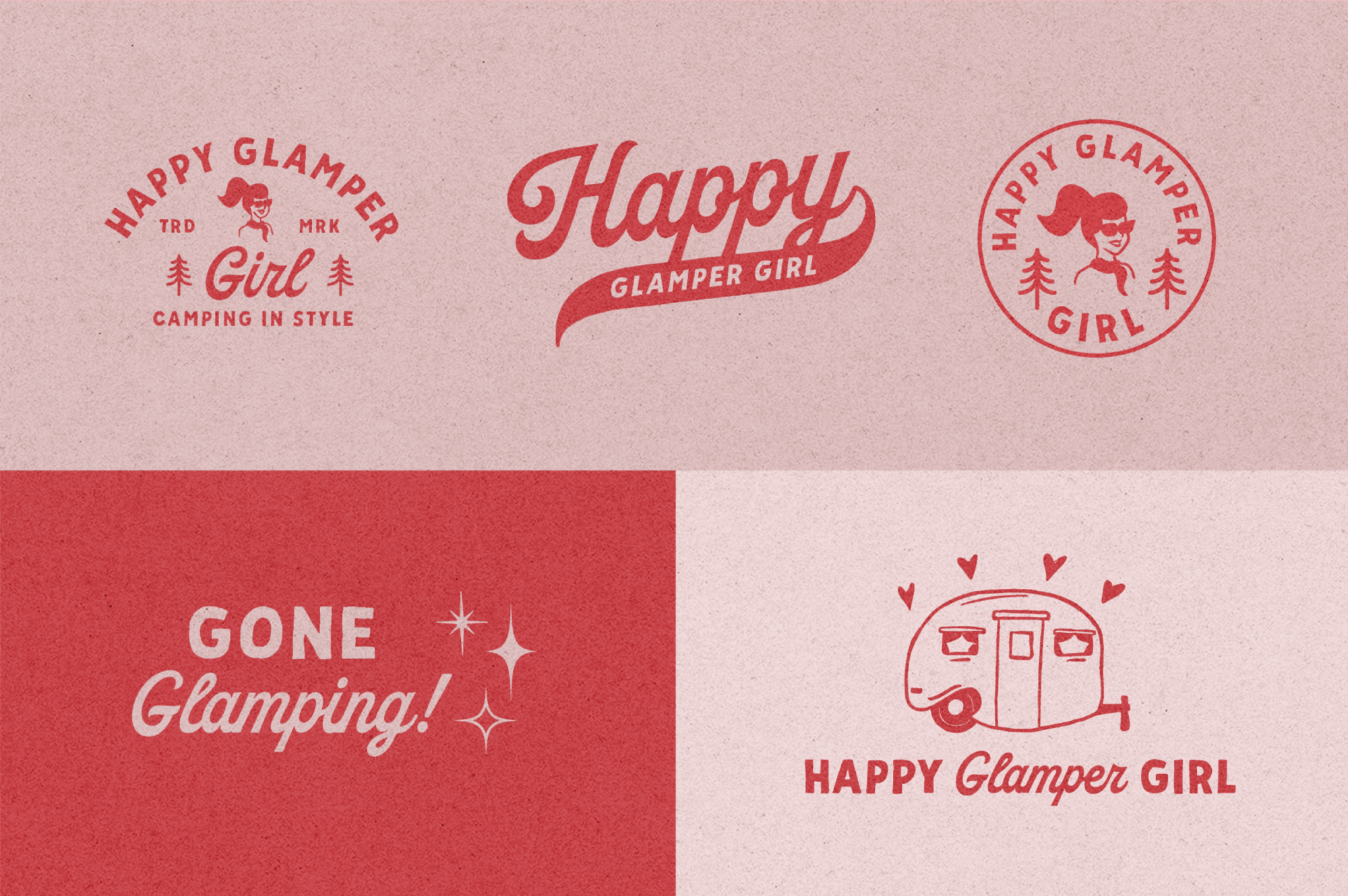
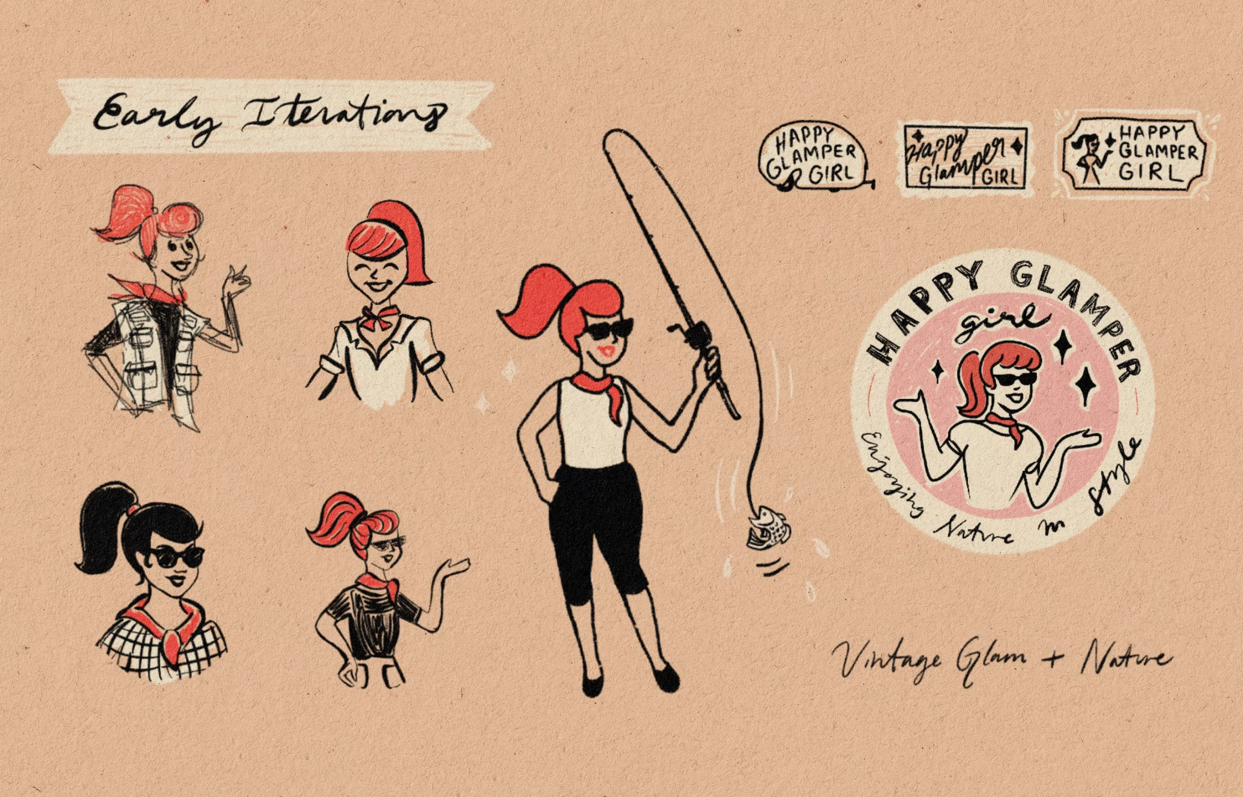
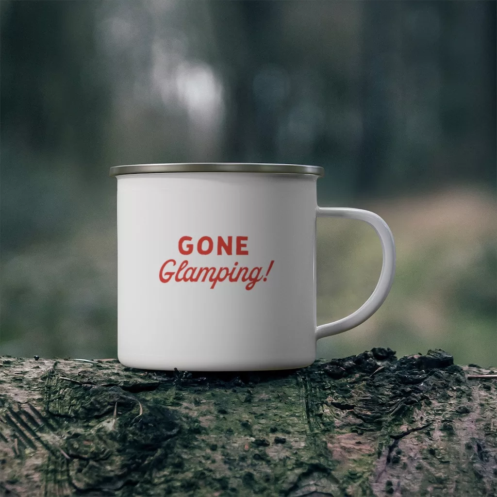
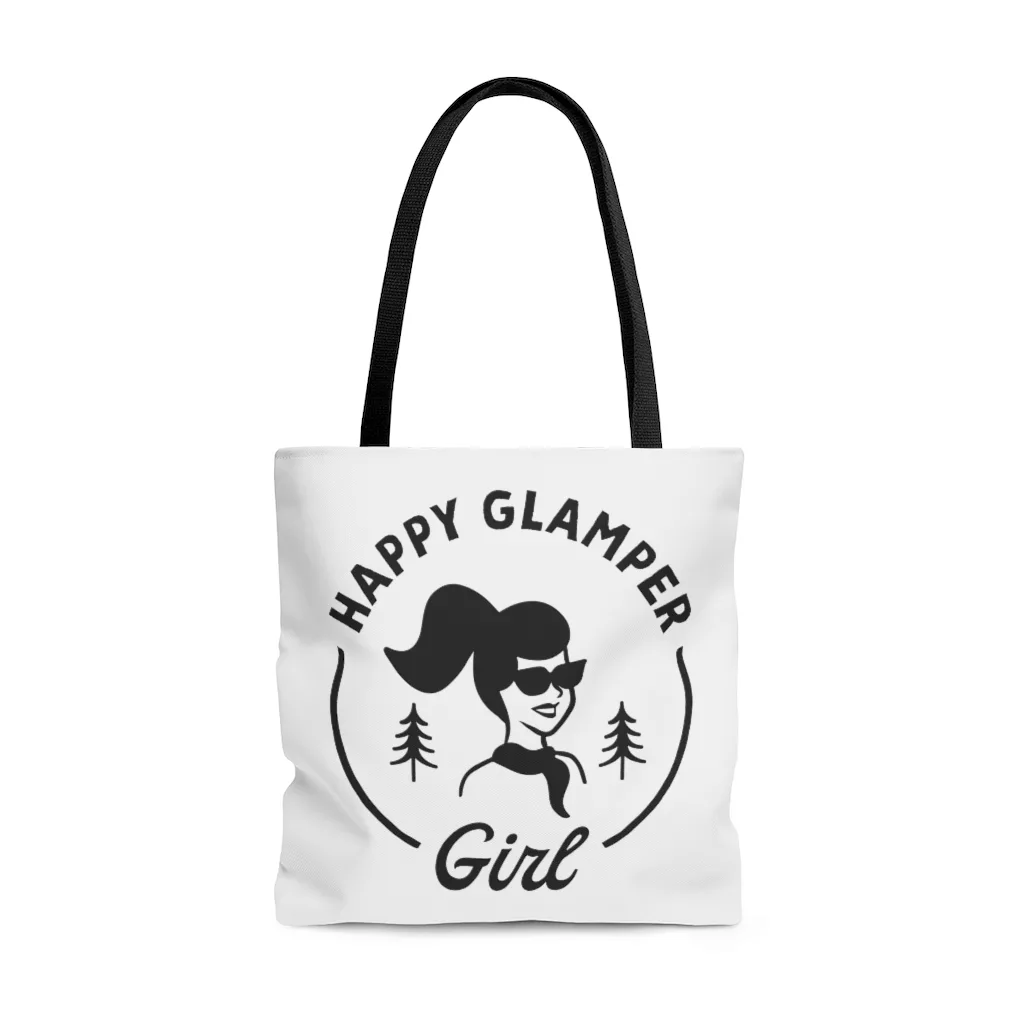
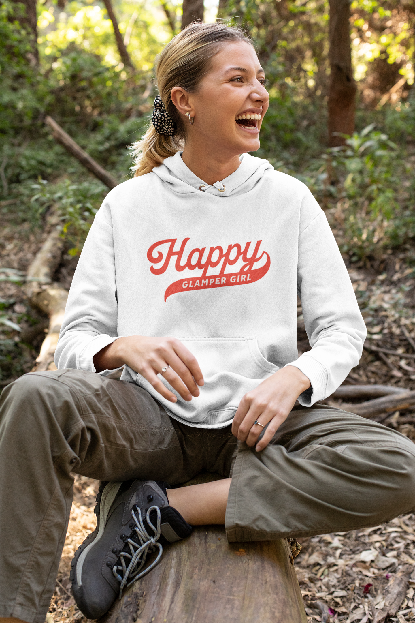
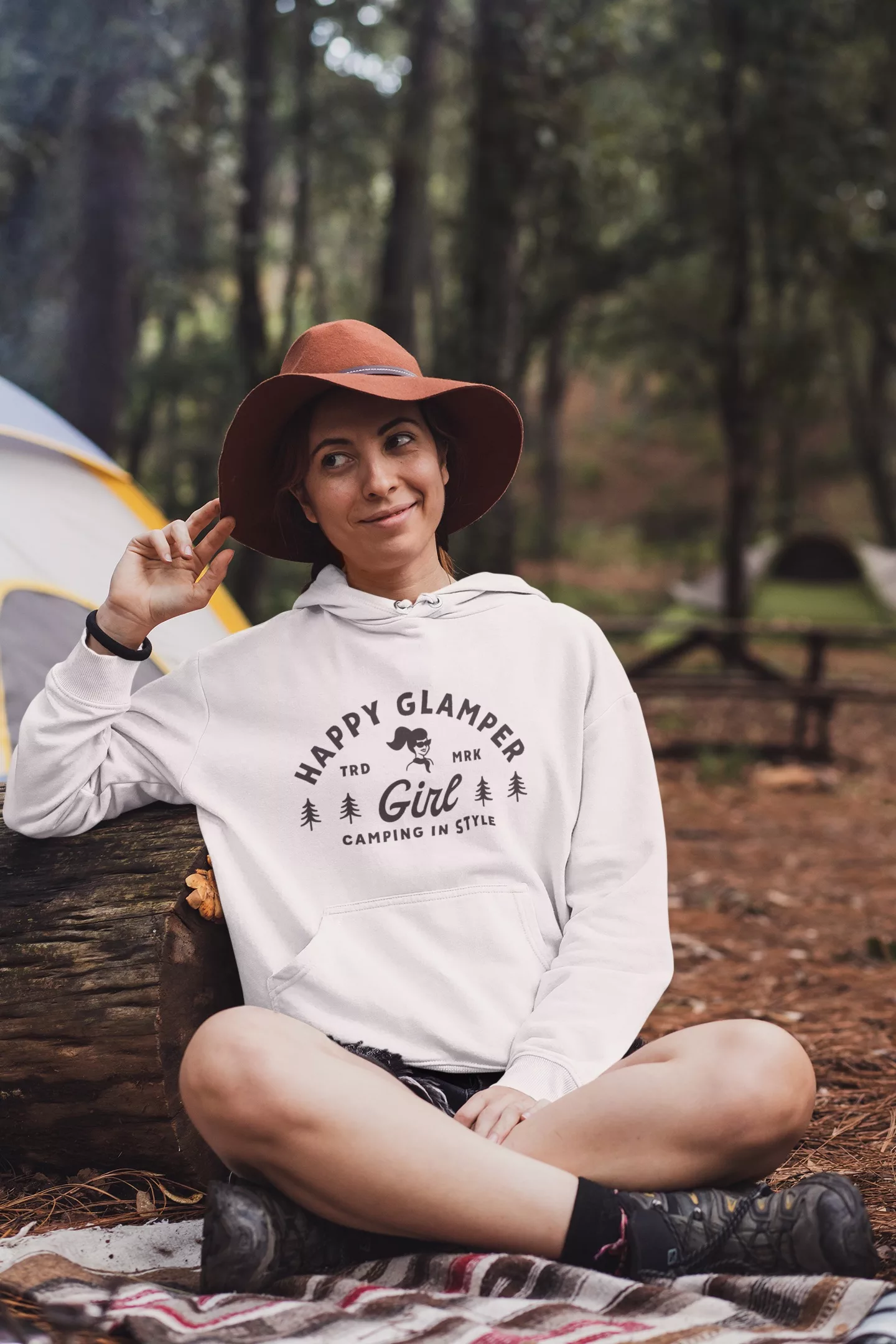
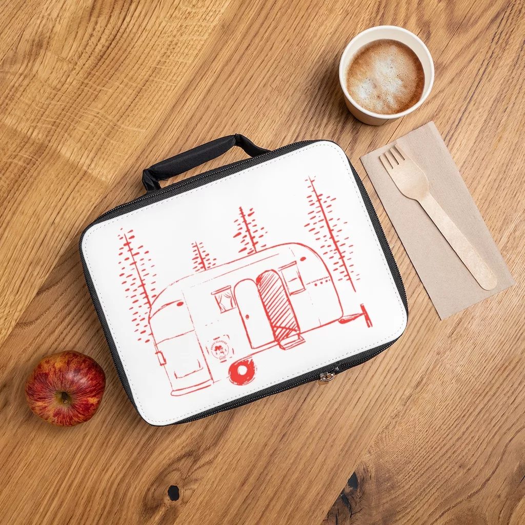
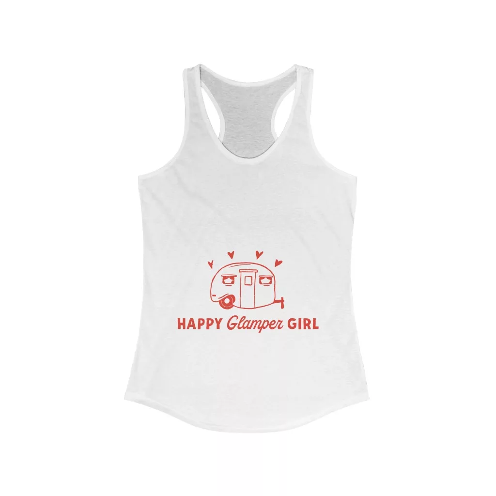
After establishing the brand elements, we moved on to creating designs for products (apparel, housewares and accessories.) From illustration-focused designs featured whimsical settings in the woods to repeating patterns and typography-driven designs, my client was very imaginative in her idea tank. 

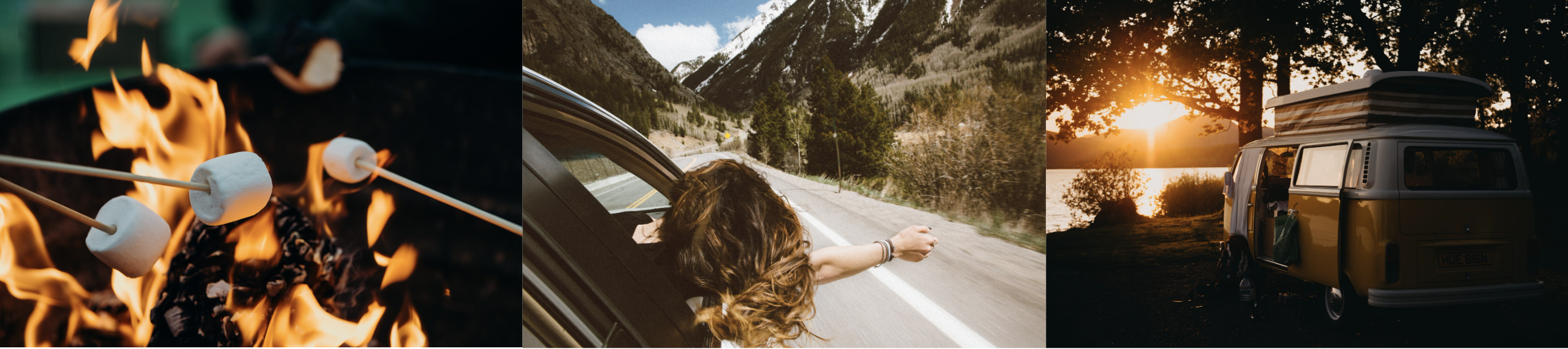
Many motifs included cute 1960s campers, campfires, hot cocoa, fishing and of course the visuals of nature. 
I'm Joanna Goebel, a freelance web and graphic designer based in Memphis, Tennessee.

Let's Connect!

[email protected]
envelope-olinkedin-squareinstagramdribbble